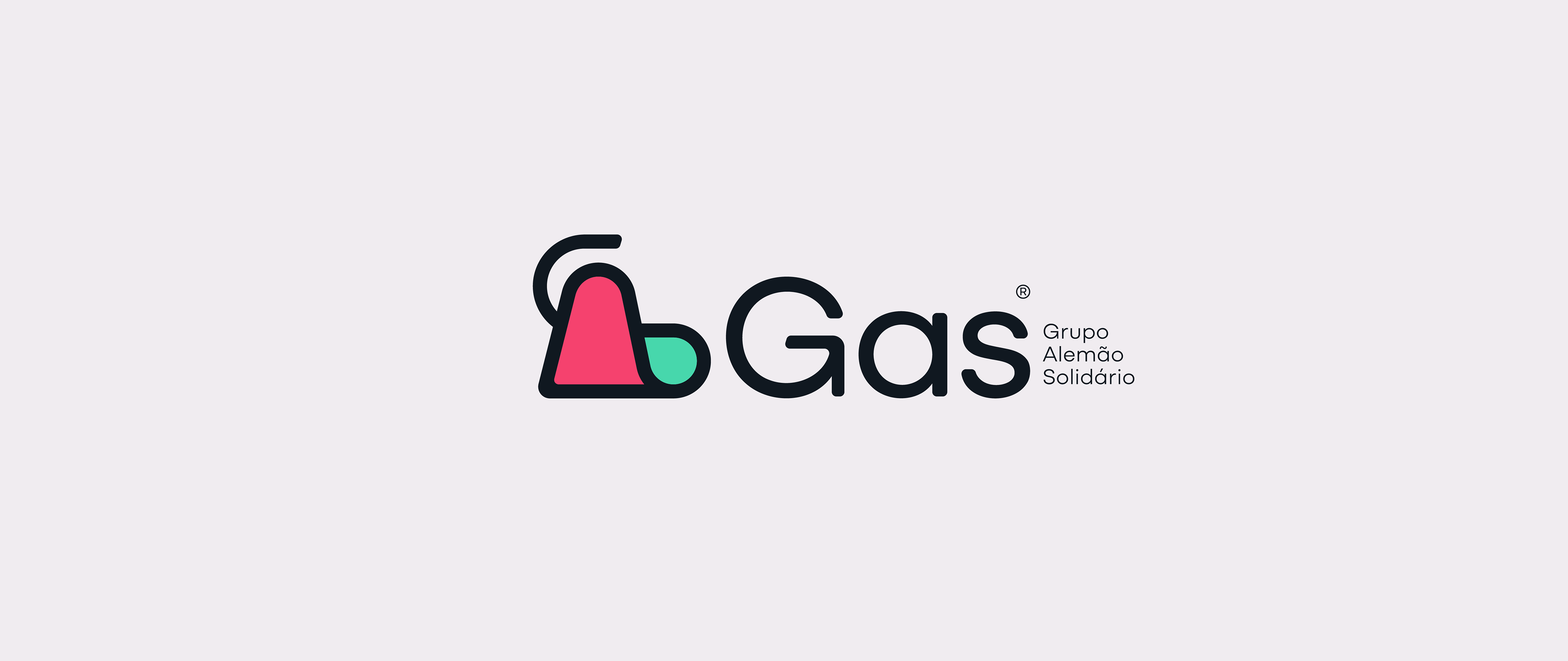


Gas - Grupo Alemão Solidário
Visual Identity
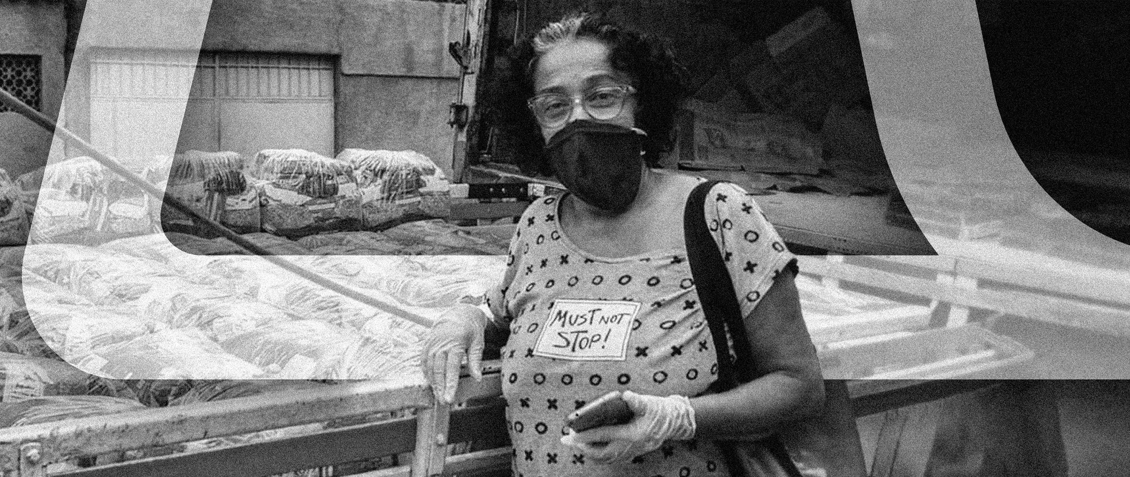
THE CHALLENGE
How to visually translate over 15 years of an NGO that moves, mobilizes, endures, and transforms? GAS – Grupo Alemão Solidário began with Mayse Freitas, a retired teacher who dedicated her life to bridging those who want to help and those in need. With Christmas, Easter, school kits, and other campaigns, the NGO has impacted hundreds of families in Complexo do Alemão. But to keep growing, it needed an identity that communicated its essence: unity, transparency, and the strength of believing that changing lives is a collective act.
THE CONCEPT
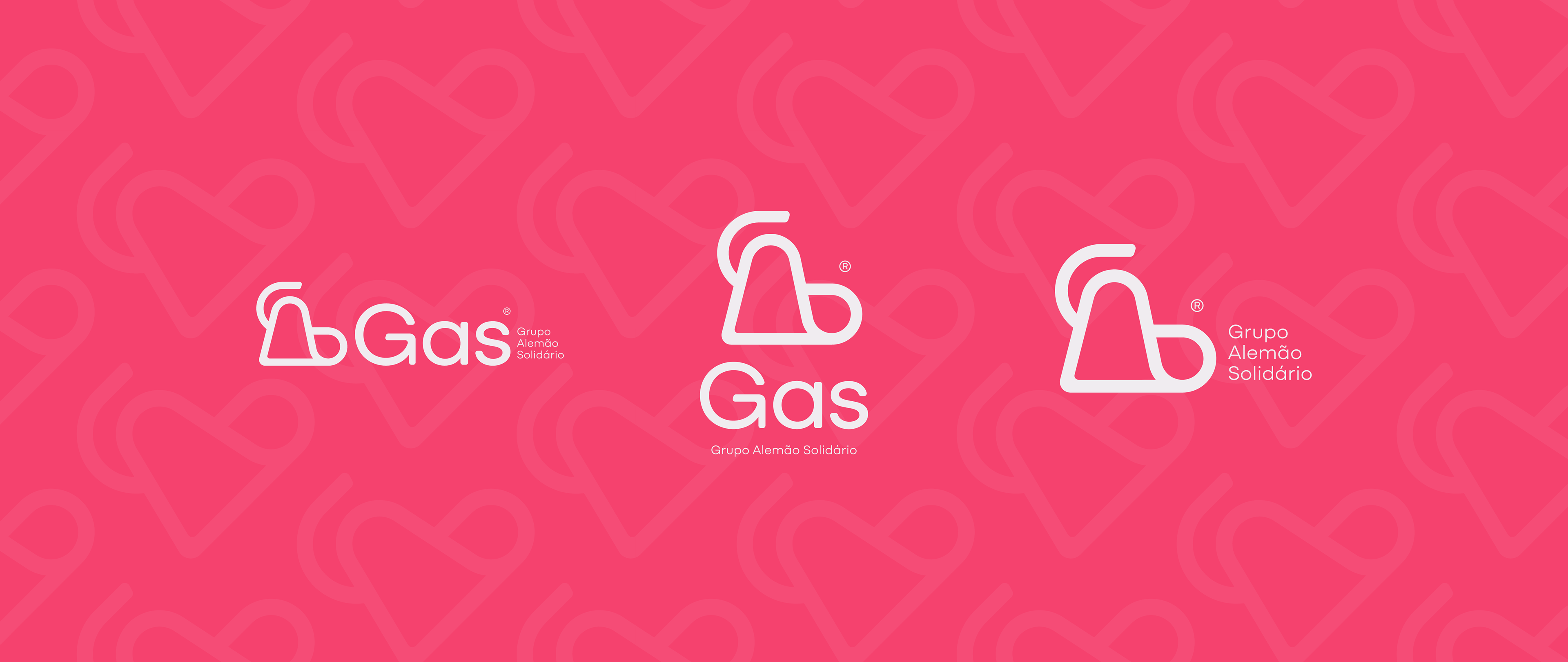
An identity that embraces and renews.
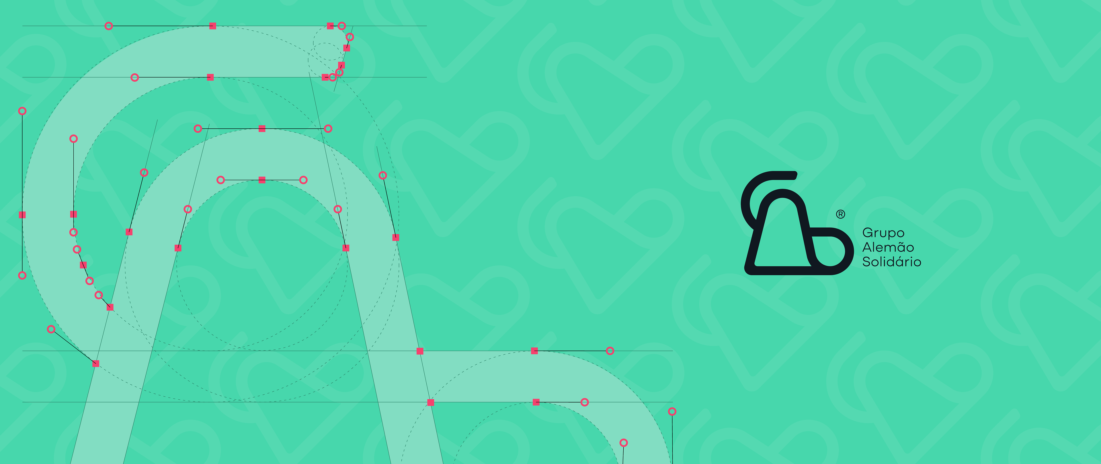
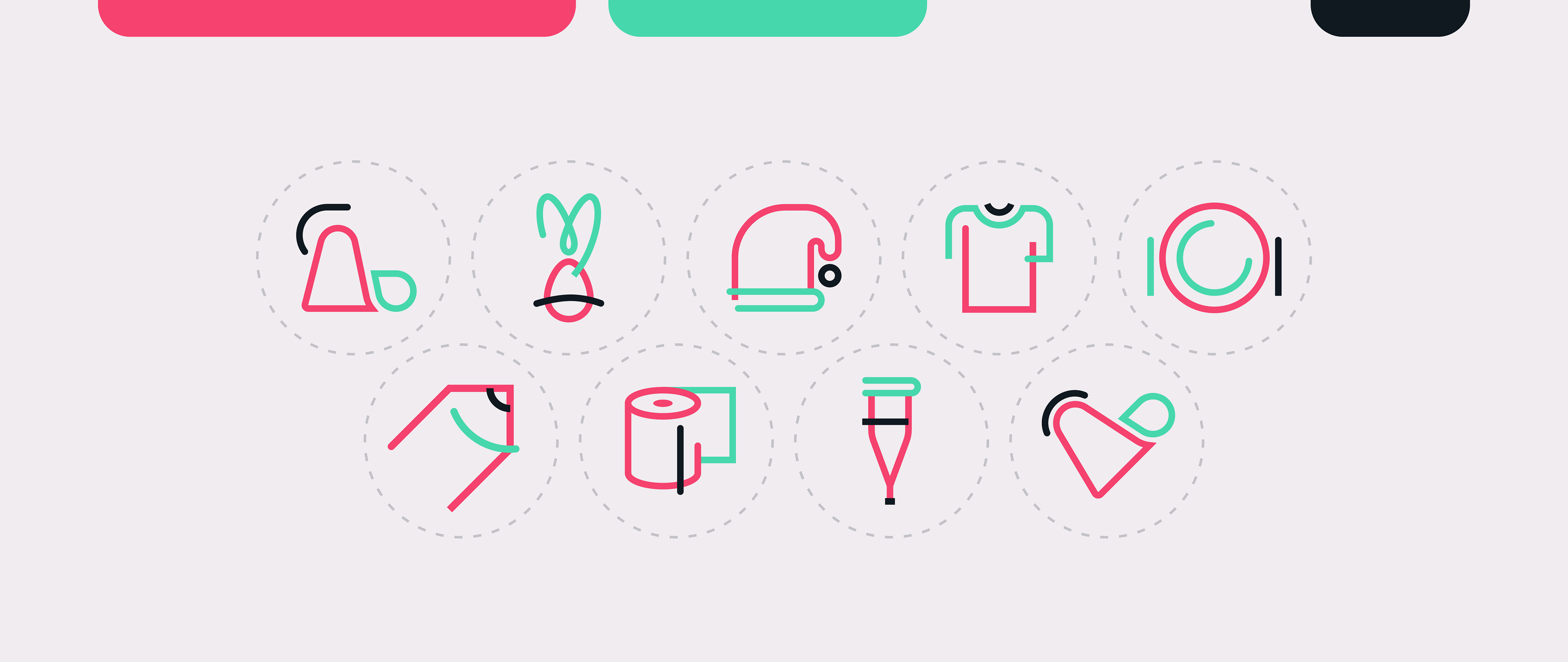
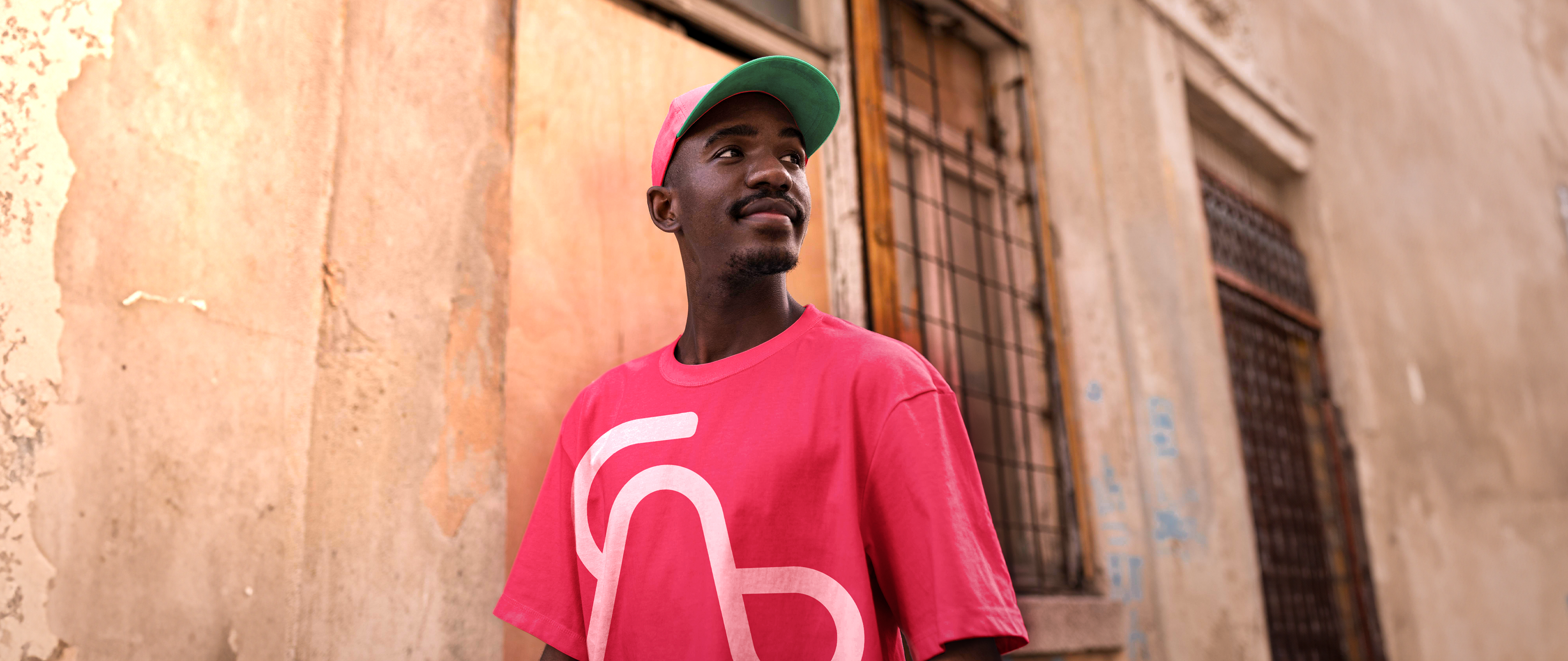
GAS’s symbol is an affective map of Complexo do Alemão. Its shapes and colors are not just graphic elements – they are a visual representation that, through semiotics, translates the solidarity embracing the community, materializing affection, hope, and resilience. Every detail was designed to highlight collective strength and the contagious energy of those who turn urgency into a future. Here, design isn’t about aesthetics: it’s about people, stories, and the certainty that, even amid adversity, embracing others is the greatest of revolutions.
GAS’s symbol is an affective map of Complexo do Alemão. Its shapes and colors are not just graphic elements – they are a visual representation that, through semiotics, translates the solidarity embracing the community, materializing affection, hope, and resilience. Every detail was designed to highlight collective strength and the contagious energy of those who turn urgency into a future. Here, design isn’t about aesthetics: it’s about people, stories, and the certainty that, even amid adversity, embracing others is the greatest of revolutions.
THE PROJECT
GAS’s visual identity is part of the "Identity Project", a non-profit initiative by NGO Voz das Comunidades in partnership with the advertising agency Kindle in 2024, which provided 7 organizations in Complexo do Alemão with professional visual identities. As the lead designer for GAS’s identity, I executed the full development process – from strategic branding research to the visual development of the brand.
O DESAFIO
Como traduzir visualmente mais de 15 anos de uma ONG que emociona, mobiliza, resiste e transforma? A GAS – Grupo Alemão Solidário nasceu das mãos de Mayse Freitas, professora aposentada que dedicou sua vida a criar pontes entre quem quer ajudar e quem precisa de ajuda. Com campanhas de Natal, Páscoa, kits escolares e outras, a ONG já impactou centenas de famílias no Complexo do Alemão. Mas, para seguir crescendo, precisava de uma identidade que comunicasse sua essência: união, transparência e a força de quem acredita que mudar vidas é um ato coletivo.
O CONCEITO
Uma identidade que abraça e renova.
O símbolo da GAS é um mapa afetivo do Complexo do Alemão. Suas formas e cores não são apenas elementos gráficos – são uma representação visual que, através de sua semiótica, traduz a solidariedade que envolve a comunidade, materializando afeto, esperança e firmeza. Cada detalhe foi pensado para valorizar a força coletiva e a energia contagiante de quem transforma urgência em futuro. Aqui, o design não é sobre estética: é sobre pessoas, histórias e a certeza de que, mesmo em meio às adversidades, abraçar o outro é a maior das revoluções.
O símbolo da GAS é um mapa afetivo do Complexo do Alemão. Suas formas e cores não são apenas elementos gráficos – são uma representação visual que, através de sua semiótica, traduz a solidariedade que envolve a comunidade, materializando afeto, esperança e firmeza. Cada detalhe foi pensado para valorizar a força coletiva e a energia contagiante de quem transforma urgência em futuro. Aqui, o design não é sobre estética: é sobre pessoas, histórias e a certeza de que, mesmo em meio às adversidades, abraçar o outro é a maior das revoluções.
O PROJETO
A identidade visual da GAS integra o "Projeto Identidades", iniciativa sem fins lucrativos da ONG Voz das Comunidades em parceria com a agência de publicidade Kindle em 2024, que beneficiou 7 organizações do Complexo do Alemão com identidades visuais profissionais. Como responsável pela identidade da GAS, executei o processo completo de desenvolvimento – desde pesquisa estratégica de branding até o desenvolvimento visual da marca.